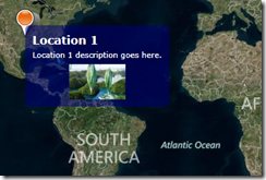
I recently had a requirement where I want to show a tooltip for pushpin and this is with Bing Maps for Silverlight. I have worked with Bing Map AJAX control, and it has this thing called Infobox which is found on Microsoft.Maps.Infobox namespace. But unfortunately in Bing Maps Silverlight control, you can’t find any Infoboxes or tooltips. But that doesn't mean, you can’t add tooltips for your pushpins in Silverlight. For that we can use, ToolTipService Class in System.Windows.Controls namespace and let’s see this in action.
Now in my Silverlight application I have several pushpins loaded into my map. First what I would do is extend the Pushpin class, so I can add some properties into it. In my tooltip I am planning to have a title field, a description field and a image. So I am adding following properties to my extended Pushpin class.
public partial class Pushpin : Microsoft.Maps.MapControl.Pushpin
{
public string Title { get; set; }
public string Description { get; set; }
public string ImageUrl { get; set; }
}
Now I should use this properties in my tooltip. For that I am going to create a new tooltip style and I will use that particular style for my tooltips.
Application.Resources in App.xaml
<Style x:Key="CustomTooltipStyle" TargetType="ToolTip">
<Setter Property="Background" Value="Transparent" />
<Setter Property="BorderBrush" Value="Transparent" />
<Setter Property="BorderThickness" Value="0" />
<Setter Property="Template">
<Setter.Value>
<ControlTemplate>
<Border CornerRadius="5">
<Border.Background>
<SolidColorBrush Color="Navy" Opacity="0.5"/>
</Border.Background>
<ContentPresenter Margin="5">
<ContentPresenter.Content>
<StackPanel Margin="5" MaxWidth="200">
<TextBlock Text="{Binding Title}" FontWeight="Bold" FontSize="16" Foreground="White"/>
<TextBlock Text="{Binding Description}" Foreground="White" TextWrapping="Wrap"/>
<Image Source="{Binding ImageUrl}" Width="80" Height="50" Margin="0 5 0 0" HorizontalAlignment="Center" VerticalAlignment="Center"/>
</StackPanel>
</ContentPresenter.Content>
</ContentPresenter>
</Border>
</ControlTemplate>
</Setter.Value>
</Setter>
</Style>
Pushpin pushpin = new Pushpin() { Title = "Location 1", Description= "Location 1 description goes here.", ImageUrl="Images/1.jpg" };
pushPinLayer.AddChild(pushpin, new Location(40, -95), PositionOrigin.Center);
ToolTipService.SetToolTip(pushpin, new ToolTip()
{
DataContext = pushpin,
Style = Application.Current.Resources["CustomTooltipStyle"] as Style
});
 |
| Output |
Happy Coding.
Regards,
Jaliya
No comments:
Post a Comment